


MediSked’s User Experience (UX) team is dedicated to making our products easy to use by all of our clients. In this blog, MediSked User Experience Designer Jess Wiltey shares how to identify and evaluate UX in everyday life, as well as the best practices that the MediSked UX team has on their minds at all times.
In our everyday lives, we are constantly using things, and in using them we are having an experience, whether it is good, bad, or in between. This is the foundational concept behind the user experience (UX) discipline. We have experiences using everything from our computers and toasters to our cars and sneakers. Think about some of the things you use on a daily basis, and whether or not your experiences with them are positive or negative. Do you have a hard time navigating things, or getting it to work properly? Is it intuitive or frustrating?
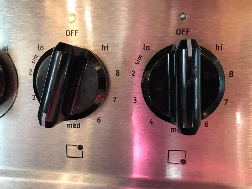
As an example, most of us can say we have a shared experience using a stovetop. I don’t know about you, but I can never remember which knob is associated with which burner, and they are never the same from stove to stove. The knobs also never seem to be in the order I assume they are in. So, 99 percent of the time, I am having to look down at the little icons to determine which knob to turn to avoid unintentional damage. But what happens when even the icons aren’t intuitive for everyone?
I came across a Facebook post recently from my friend, Jan Gartner, who (likely unknowingly) gave a perfect example of the prominence of everyday user experience. Jan has had the same stove for years and still has to triple-check which burner she is turning on, because the icons below each knob may look nice, minimalistic, and modern, but they just aren’t clear enough to her at a glance.
Jan lamented, “Everyone has a mind block on something. Mine is which burner goes with which knob. Yes, I know there’s a little picture. It isn’t intuitive to me. Just now I switched knobs to the WRONG one because I thought I had turned on the wrong one to start.” In a casual social media post, and I was surprised (and also validated) to see many commenters sharing her frustrations, replying “Totally me!” or “Omg. Yes.”, as we all just go about our lives accepting this nearly universally terrible experience, and probably burning a few decorative covers in the process.
The same concept of good and bad experiences applies to software. As our lives become more and more saturated with technology, we need that technology to be helpful. Additionally, as users become more tech-savvy, they also become aware of which products have good experiences, and which have bad ones. Our goal as UX designers is to create products that help our users and add value to their daily lives. We strive to make their tasks easier and reduce cognitive load. But, how do we achieve that? The following are a few best practices of user experience design for software that can help guide us toward creating helpful, and not hindering, experiences for all users.
Designing for the edge case makes a better experience for all
Designers are (usually) not the target users for the products they are working on. We cannot design in a vacuum and must consider perspectives well outside of our own. We have to have a keen sense of empathy for even the most unlikely of use cases – also known as “edge cases.”
For example, consider your grandparents. If your design can be easily navigated by someone from a massively less tech-savvy generation, it will end up being simple and intuitive enough to also create a good experience for a Gen-Z superuser who could do it with their eyes closed.
Less is more, until it’s not
There is nothing worse than trying to navigate an application full of fluff. Distracting screen clutter can take a good experience and turn it into an overwhelming one. Keep decisions that the user needs to make minimal to reduce the cognitive load of the experience. People generally have a limited amount of working memory, so don’t use it all up forcing them to navigate through 87 levels of menus to get to the one task they want to complete, or they may very well forget what they were doing in the first place.
On the opposite end of that spectrum, though, we shouldn’t oversimplify things either. A clean white screen with a few unlabeled icons might be peak modern minimalist aesthetic, but, just like the stove burner icons, that means nothing if no one can use it. Additionally, minimalism encourages sameness amongst products, and hinders our creative soul and liberty. Don’t constrain your design into the tiny boxes that are the patterns and systems created by designers of yesteryear, from Vignelli to Material Design, just because you have been forced into thinking that you have to. After all, rules are made to be broken, right?
Consistency, consistency, consistency
If you’ve ever experienced a website that had different styles or elements applied to different pages, you know that it doesn’t just look disorganized, but it makes it harder to use. If a user has to learn new design patterns on every page of a website or application, they’re simply not going to have a good experience.
Consistency is important in every aspect of a design from the literal colors and fonts to the not-so-literal workflow patterns and even the tone of the content.
To recap, unless you are a UX designer, you probably don’t actively think about the user experience discipline. However, we truly are inundated with it in our daily lives. Whether we are designing software or a chair, we should always consider and empathize with the product’s end-user. Consider the user’s feelings, ask for feedback, and stay open to improvement. Progress and improvement surpass absolute perfection in this case because no product or person is 100% perfect. Products are ever-evolving and improving as a result. At the end of the day, good software should be just as comfortable as a good chair.